AN INDIAN TYPE PIONEER’S JOURNEY
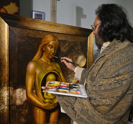
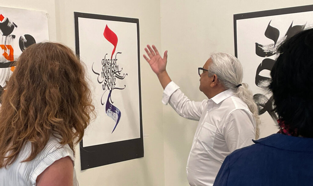
For over three decades, veteran type designer and Art Director Rajeev Prakash Khare has stood at the intersection of India’s technological and cultural shifts. From hand-rendering Devanagari lettering for packaging in Varanasi to engineering expressive digital fonts, his pioneering work has helped shape the visual identity of Indian vernacular scripts, proving that timeless craftsmanship remains vital even in the age of AI.
How did Varanasi shape your initial understanding of letterforms and pull you toward type design? My journey actually began in 1981 in Allahabad as an apprentice to an exceptional lettering artist, Shakeel Sahib, at Maya Press. Hand-designing headlines for popular Hindi magazines like Manohar Kahaniyan was where my intimacy with letters truly started. When I joined the Faculty of Visual Arts at Banaras Hindu University (BHU) in 1982, my artistic perspective expanded across disciplines. I learned the nuances of Roman and Devanagari typography from mentors like Gajjar Sir, Vijay Singh Sir, and Hiralal Prajapati Sir. Simultaneously, studying ancient manuscripts at the Bharat Kala Bhavan museum and observing the vibrant, hand-painted street signboards of Varanasi laid the foundation for my career in type design. Could you walk us through your early, manual design workflow 35 years ago? The absence of digital tools was a blessing; manual precision became my foundation. Working evenings at Kapooriya Advertising Agency, I hand-rendered tiny Hindi and English text at 12 to 16 points for packaging and labels because commercial typesetting was too expensive
Q1. Looking back at your formative years at the Faculty of Visual Arts, BHU, how did the cultural, artistic, and academic environment of Varanasi shape your initial understanding of letterforms? Were there specific mentors or local calligraphic traditions there that pulled you toward type design?
Answer: Before I talk about BHU, I would like to go back a little further to a formative period in my life. This was in 1981, when I was in Allahabad preparing to build a career in Applied Arts. I had a year before joining college, so I started working as a trainee artist at Maya Press. There, I had the opportunity to work with an exceptional lettering artist, Shakeel Sahib. His skill, discipline, and approach to letterforms left a deep impression on me, and I became his apprentice. In many ways, that was where my journey with lettering truly began.
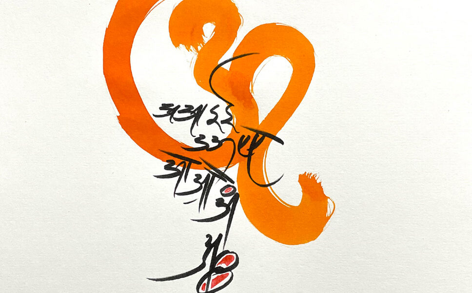
During that time, I had the opportunity to design headlines for popular Hindi magazines such as Manohar Kahaniyan, Satyakatha, and Manorama. Interestingly, I did not even know then that what I was learning and practicing would later be recognized as calligraphy.
In 1982, I joined the Faculty of Visual Arts at Banaras Hindu University. For me, it was an entirely new world. Beyond Applied Arts, I was exposed to disciplines such as Painting, Sculpture, Pottery, and Textile Design. This multidisciplinary environment broadened my artistic perspective and helped me understand visual form in a much richer way. Yet my strongest interest remained lettering and typography.
At BHU, I had the privilege of learning from distinguished teachers such as Gajjar Sir, Vijay Singh Sir, and Hiralal Prajapati Sir, who introduced me to the principles and nuances of both Roman and Devanagari typography. Equally influential were the remarkable manuscript collections housed at Bharat Kala Bhavan. Studying these historical works deepened my appreciation of letterforms, calligraphic traditions, and the visual culture of writing. Their influence would later prove invaluable in my work as a type designer.
The city of Varanasi itself was also an important teacher. The typography I encountered on shop signs, street hoardings, and hand-painted lettering throughout the city constantly informed my visual sensibility. At the time, I was not fully aware of how significant these influences would become. Looking back, however, I can clearly see that the cultural, artistic, and academic environment of Varanasi collectively shaped my understanding of letterforms and laid the foundation for my future journey in type design.
Q2. Thirty-five years ago, type design didn’t have the luxury of modern software like Glyphs or FontLab. Could you walk us through your early design workflow? What was the tactile experience of drawing complex ligatures, matras, and conjuncts by hand on paper before they became final typefaces?
Answer: Ironically, the absence of today’s technology turned out to be a blessing in my life. People often ask how that could be possible. The answer is simple: everything that is now done on a computer had to be done by hand in those days, and that intensive manual practice became the foundation of my career.
From my first year at BHU, I worked part-time in the evenings at Kapooriya Advertising Agency. Most of the design work there was created manually. Whether it was labels for sindoor containers, local detergent packaging, or namkeen wrappers, the Hindi and English lettering was often drawn by hand. Typesetting was expensive, so hand-lettering was usually the preferred solution. As a result, I developed the ability to draw small-size lettering with remarkable precision and I could comfortably hand-render Hindi text at 12 and 14 points, and Roman typefaces such as Times Roman and Helvetica at around 16 points.
I often say that if computers had been widely available then, I might never have developed such a deep understanding of letterforms through hand practice.
This experience became invaluable in 1988 when I had the opportunity to design typefaces on a computer at the Industrial Design Centre (IDC), IIT Bombay. The software and hardware available at the time were extremely basic. Designing a complex Devanagari typeface using Fontographer on a 7-inch Apple Macintosh Classic screen was far from easy. But for someone who had spent years drawing intricate lettering by hand for packaging and advertising, these limitations felt less intimidating.
The real challenge was the complexity of the Devanagari script itself. We were designing multi-level fonts that included vowel signs, conjuncts, and combinations where matras appeared above and below conjunct characters. At that time, Indian-language fonts had to be built on top of coding systems originally developed for English, which were not designed to accommodate the structural complexity of Devanagari. A complete Devanagari font also needed to support Sanskrit and Vedic Sanskrit characters, adding another layer of complexity.
Because of these technical constraints, characters often had to be broken into smaller components and assembled digitally. This created significant challenges in alignment, especially for matras and conjuncts. I often describe that period as the “era of compromises,” when designers constantly had to balance typographic integrity against technological limitations.
The design process itself was also very different from today. Every character was first drawn on paper and then scanned into the computer. The scanners available at the time were relatively low resolution, so the images often appeared distorted or jagged once they reached the screen. Considerable effort was required to clean up and refine the outlines before they could become usable digital typefaces.
Looking back, the tactile experience of drawing every stroke, ligature, matra, and conjunct by hand gave me an intimate understanding of the script’s structure. That deep familiarity with the anatomy of Devanagari became one of the greatest advantages I carried into the early era of digital type design.
Q3. Unlike the Latin alphabet, Indian vernacular scripts (like Devanagari) have complex anatomy—the shirorekha (hanging top line), intricate conjuncts, and non-linear matra placements. What was the biggest technical or aesthetic challenge you faced back then when trying to maintain legibility without losing the soul of the script?
Answer: The biggest challenge was balancing the structural complexity of Devanagari with the technological limitations of the time. Unlike Latin scripts, Devanagari has a large character set that includes vowels, consonants, matras, conjuncts, and numerous ligature combinations. Yet we had to accommodate all of these within a very limited coding environment.
The most difficult aspect was handling matras and conjuncts. Matras can appear to the left, right, above, or below a character, and in many cases they must interact with complex multi-level conjuncts. Ensuring that these elements aligned correctly while maintaining visual harmony was a constant challenge. Every adjustment affected readability, spacing, and the overall rhythm of the script.
Beyond the technical constraints, there was also an important aesthetic responsibility. Devanagari has a distinct visual identity shaped by features such as the shirorekha, the proportions of its characters, and the intricate relationships between its components. If we simplified these elements too much, the typeface might become easier to produce technically, but it would lose the character and cultural essence of the script. On the other hand, preserving every traditional detail could make the font difficult to implement within the limitations of the available technology.
Another challenge was the diversity of users we had to serve. The same font might be used by newspapers, magazines, textbook publishers, literary and religious publishers, the film industry, desktop publishing studios, advertising agencies, government offices, television channels, and later websites. Each of these environments had different requirements for readability, space efficiency, and visual expression.
The real task, therefore, was not simply designing letters, it was creating a system that could accommodate the richness of the Devanagari script while remaining practical, legible, and versatile across a wide range of applications. Maintaining that balance between functionality and the soul of the script was perhaps the greatest challenge of early Indian type design.
Q4. When you began designing, many printed materials still relied on classic calligraphic structures. How did you approach simplifying or adapting these traditional letterforms for the changing demands of modern publication and printing technology 35 years ago?
Answer: When I began designing typefaces, I was fortunate to have access to historical manuscripts preserved in libraries, museums, and religious institutions. Studying these documents gave me a deep appreciation for the richness of traditional Indian letterforms and the subtle qualities that give them their unique character. However, translating that character into a modern medium was never straightforward.
During my time at IIT Bombay, I had the opportunity to study the typefaces of Nirnaya Sagar, one of India’s most important historical type foundries. Their hot-metal Devanagari typefaces were remarkable examples of craftsmanship and typographic excellence. The foundry also published books, and its work became a major source of inspiration for me.
One of the most important lessons I learned was that the beauty of traditional typefaces often lies in their imperfections. In the letterpress era, characters were not always perfectly aligned, spacing was not mechanically uniform, and printing introduced subtle variations from one impression to another. These irregularities gave the type a warmth, rhythm, and human quality that became part of its visual identity.
The challenge of digitization was that modern technology naturally pushes designers toward precision and consistency. As a result, many digitized versions of historical typefaces became cleaner and more mechanically perfect, but in the process they often lost some of the personality and soul that made the originals so distinctive.
I experienced this challenge firsthand when I was commissioned by a renowned publisher to digitize a Nirnaya Sagar typeface. My intention was to preserve as much of the original character as possible; the proportions, texture, and visual rhythm that reflected its hot-metal origins. However, the client preferred a more refined and polished result. While the final typeface met contemporary expectations, I felt that some of the charm and authenticity of the original had been sacrificed.
For me, the goal has never been to simply reproduce historical forms, but to understand what gives them life and then carry that spirit into a new technological context. That balance between preservation and adaptation remains one of the most fascinating challenges in type design.
One of my long-standing aspirations is to create a faithful digital revival of the Nirnaya Sagar typefaces where it retains the distinctive characteristics, texture, and warmth of the original hot-metal fonts while making them accessible to contemporary users.
Q5. You have stood at the crossroads of a massive technological shift in India. What was it like when computers and early digital font formats first arrived? Did you feel the technology initially restricted your creative freedom with Indian scripts, or did it open new doors?
Answer: I would like to answer this question with a memory from my childhood. From the 5th to the 8th grade, I was required to write a page of Sulekh – the practice of beautiful Hindi handwriting every day. The credit goes to my Sulekh teacher, who was extremely strict. To be honest, I was more afraid of his punishments than motivated by artistic ambition! But that daily discipline had a lasting impact on me. Without realizing it, I was training my eye, hand, and mind to understand the structure, rhythm, and beauty of letterforms.
Over the last five decades, I have witnessed and worked through nearly every stage of typographic technology ranging from reed pens and ink on paper, crow quills, rotering pens and compasses, to hand composition for letterpress printing, desktop publishing, websites, and today’s digital platforms. This long journey has allowed me to see both the craft traditions and the technological evolution of type design.
Because of this background, I have always viewed technology as an opportunity rather than a threat. Every new technology arrives with limitations, but it also opens new possibilities. When desktop publishing (DTP) entered the industry, for example, laser printers typically produced output at around 300 DPI, while phototypesetting systems could achieve resolutions of 1200 DPI or more. The print quality of early laser output was clearly inferior. Yet despite its technical shortcomings, DTP democratized publishing and created entirely new opportunities for designers and type developers.
For me personally, it opened the door to digital type design. I began designing typefaces for laser printers in the late 1980s, working within severe technological constraints. Memory was limited, screen resolutions were low, and font technologies were still evolving. Indian scripts presented additional challenges because their complexity far exceeded what early digital systems had been designed to handle.
Yet I never felt that technology restricted my creativity. On the contrary, the constraints challenged me to think more creatively. The task was not simply to reproduce traditional forms, but to reinterpret them within a new medium while preserving their essential character. One example of this approach is my typeface Alankar, which was developed within the limitations of early digital technology but still sought to retain a strong sense of visual expression and typographic identity.
Looking back, I would say that technology certainly imposed constraints, but it opened far more doors than it closed. It enabled Indian scripts to move from specialized printing environments to personal computers, digital publishing, the web, and eventually global communication platforms. For type designers, it transformed what was possible and expanded the reach of our work in ways we could hardly have imagined.
Q6. For a long time, the global design conversation was heavily centered around Latin typography. When you were building these vernacular fonts, did you feel you were not just creating type, but actively building a visual identity for Indian languages that had been overlooked?
Answer: It is true that for a long time, the global discourse around typography and design was largely centered on English and Latin scripts. Most design education, software, and technological developments were created with Latin typography in mind. This had been the norm for decades.
However, the situation began to change with globalization and localization, especially over the last four decades. As computers became more widespread, there was a growing need to support Indian languages in publishing, administration, education, and communication. This created an important opportunity and responsibility for designers working with Indian scripts.
When I was developing vernacular typefaces, I certainly saw my work as more than just creating fonts. My goal was to help Indian languages find a meaningful presence in the digital world. A language cannot thrive on computers without a robust typographic infrastructure. Fonts are not merely technical tools; they are visual carriers of language, culture, and identity.
After completing my postgraduate studies at IIT Bombay, I had the opportunity to work closely with government offices, Rajbhasha Vibhaag, universities, and various institutions across the country. Through these engagements, I became involved in creating awareness about Indian-language computing and digital publishing. Over the years, I have delivered more than a thousand lectures, workshops, and demonstrations on Indian-language typography and publishing technologies. Along with my team, I have also trained more than 10,000 users in using Hindi on computer platforms, specially Microsoft Office.
Looking back, I feel that my contribution was not limited to designing typefaces. Equally important was helping people understand that Indian languages belong in the digital ecosystem and deserve the same technological support and typographic quality that had long been available to Latin scripts.
My dream has always been to see Indian languages used confidently and creatively on Indian computers. In that sense, every typeface I designed was not only a design project but also a small step toward strengthening the visual identity and digital future of Indian languages.
Q7. Out of the many vernacular typefaces you’ve developed over more than three decades, is there one specific font that was particularly challenging to birth, or one that holds the most deeply personal story for you? What makes it special?
Answer: Over the course of more than three decades, I have designed many typefaces, and each one carries its own story, challenges, and memories. It is difficult to choose just one because every project taught me something different. However, if I had to select a typeface that is especially close to my heart, it would be Murli.
The story behind Murli is quite unique. At the time, I was working with a major printing client who was purchasing a complete computer system, including printers and scanners. During the discussions, his son expressed a strong desire for a handwritten-style Devanagari font. The challenge was that the deadline was extremely tight.
I decided to create the typeface directly on the computer, which was quite unusual in those days, and completed the entire design in just three days. What made the project special was that I did not base it on an existing calligraphic model or historical reference. Instead, I drew inspiration from my own handwriting I had developed through years of practice since childhood, including the daily Sulekh exercises that had shaped my understanding of letterforms.
In many ways, Murli became a digital expression of my personal writing style. It carried the rhythm, movement, and character that felt natural to my hand. Because of this, the typeface has a deeply personal connection for me. It is not just a font; it is a reflection of a lifelong relationship with handwriting, calligraphy, and the Devanagari script.
Even today, when I look at Murli, I am reminded of how years of practice, observation, and craftsmanship can sometimes come together in a single project. That is why it remains one of the most memorable and meaningful typefaces of my career.
Q8. Today’s generation of designers can generate a variable font with a few clicks. However, many feel that modern digital type sometimes lacks ‘soul.’ What is that crucial element from the classical era of type design that you think young designers need to hold onto?
Answer: I believe the process of type design can broadly be understood through three different roles.
The first is the type designer who comes from a background in lettering or calligraphy and has extensive experience working with pen, ink, and paper. Such designers develop a deep understanding of form, rhythm, proportion, and the visual personality of letterforms.
The second is the type digitizer, who specializes in translating those forms into digital outlines. They understand the technical aspects of drawing, refining, and optimizing letterforms within software environments.
The third is the type engineer, who may not necessarily have a background in calligraphy or visual design but possesses expertise in font technologies, programming, character encoding, rendering systems, and the increasingly complex technical requirements of modern type design.
In an ideal world, a type designer would have some understanding of all three disciplines, although in practice most people become specialists in one area. What is most important is mastery in whatever role one chooses to pursue. The best typefaces are often created when these different skills come together in collaboration.
When people say that modern digital type sometimes lacks “soul,” I do not think the problem lies in technology itself. Technology is only a tool. The real issue is that many designers begin with the software rather than with the idea. They start drawing on a computer before they have fully understood the script, its history, its visual logic, and its cultural context.
Great typefaces are rarely created quickly. Some of the world’s most enduring designs, such as Times Roman, Bodoni, and Helvetica, evolved through years of refinement and continue to be studied and appreciated today. Behind every classic typeface lies a deep understanding of form, purpose, and craftsmanship.
Before opening any software, a designer should spend time developing the fundamental concept. They should understand the possibilities and limitations of the technology, but they should also understand the script itself on how it is written, how it is read, and what gives it its unique character. Only then can technology serve the design rather than dictate it.
For me, the “soul” of a typeface comes from observation, patience, practice, and respect for the script. These qualities cannot be generated with a few clicks. Technology can accelerate the process, but it cannot replace the years of study and sensitivity required to create a truly timeless design.
If there is one lesson I would pass on to young designers, it is this: there are no shortcuts to creating a classic typeface. Tools may change, but craftsmanship remains timeless
Q9. As an alumnus of BHU who has spent a lifetime enriching India’s visual landscape, what advice would you give to young Indian typographers who want to design for our diverse linguistic heritage in this age of screens and AI?”
Answer: I would like to begin where my journey began. As a student, I was fascinated by the typography I saw around me, in shop signboards, hand-painted hoardings, and street lettering. At the time, I did not know why they attracted me so much, but those everyday letterforms quietly shaped my understanding of typography.
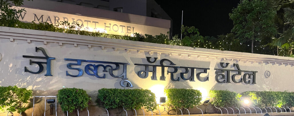
Today, it is deeply satisfying to see my fonts being used across India – in books, newspapers, railway stations, airports, metro systems, and public signages. For a type designer, there is no greater reward than seeing your work become part of people’s daily lives.
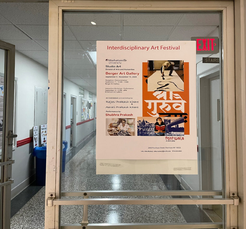
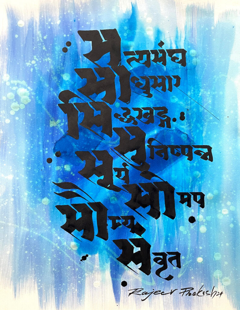
The journey has also taken me beyond India. In 2024, I held a calligraphy exhibition at Manhattanville University in New York, visited Apple in California, and was invited by Stanford University to discuss the evolving landscape of Indian-language typography. These experiences reinforced my belief that Indian scripts and typographic traditions have global relevance.
My advice to young Indian typographers is simple: be curious, patient, and passionate about the scripts you work with. Technology today, especially after Unicode, has made type design far more accessible than it was when we started. But technology alone cannot create meaningful typefaces.
Spend time understanding the history, structure, and cultural context of the script. Study manuscripts, handwriting, signboards, and printed material. The strongest designs emerge from observation and deep engagement with the script, not just from software.
This is an exciting time for Indian typography. There is growing demand for custom typefaces across publishing, branding, technology, and corporate communication. AI and new tools will continue to transform the field, but designers who combine technology with cultural understanding and craftsmanship will always stand out.
India’s linguistic heritage offers immense opportunities. Embrace new technologies, but stay connected to the spirit of the script. If you do that, you can help shape the future visual identity of Indian languages.